ABSTRACT
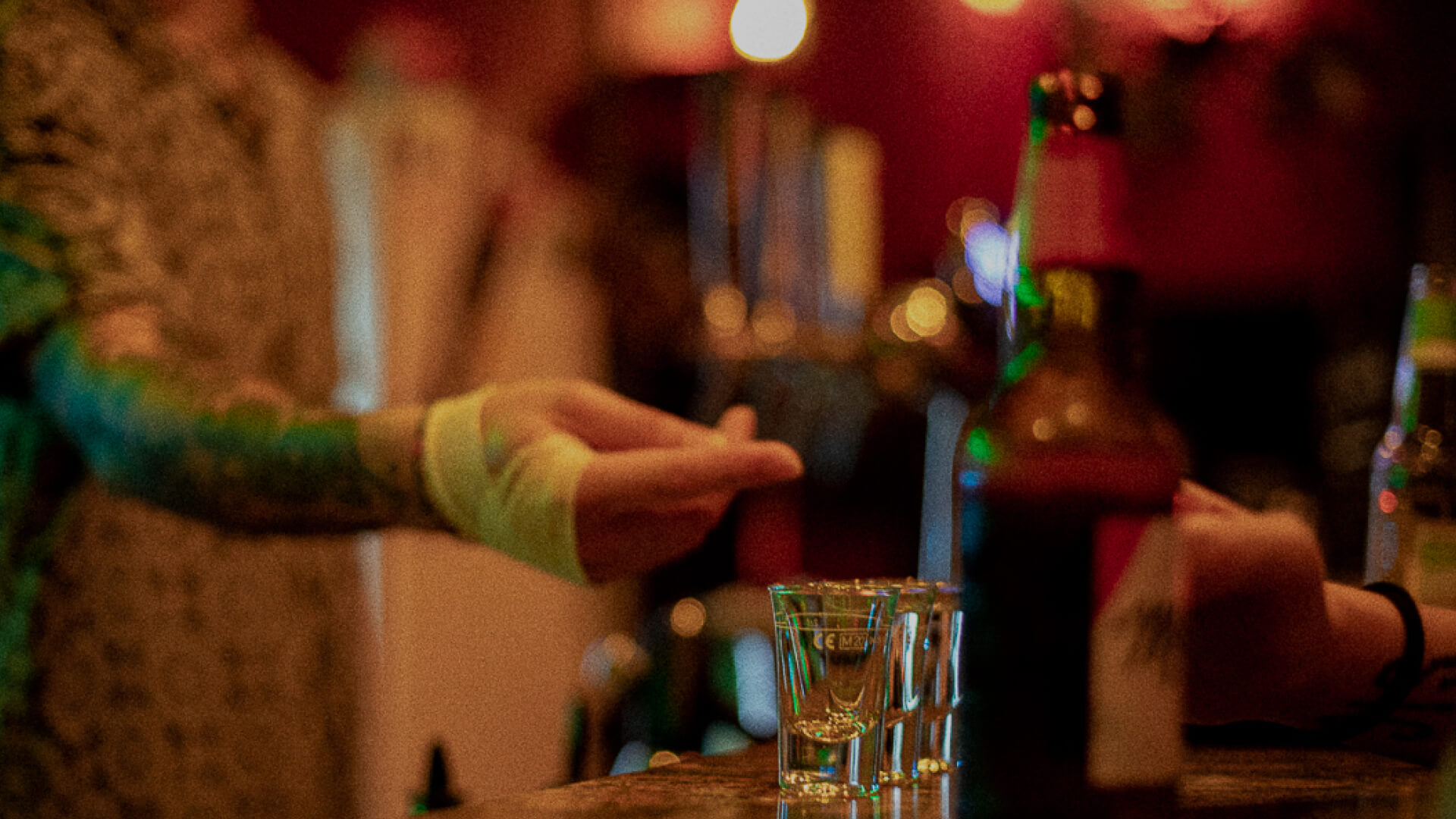
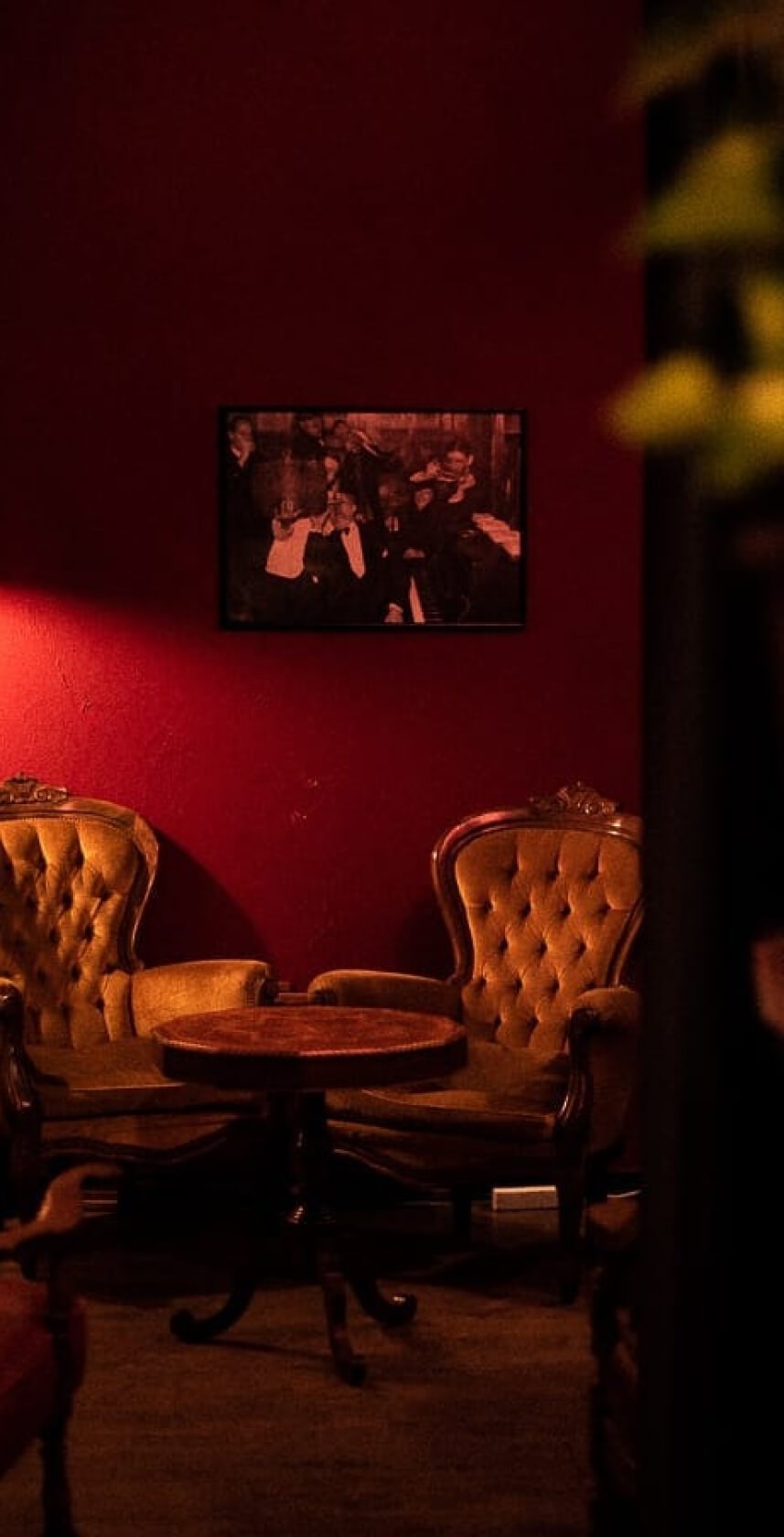
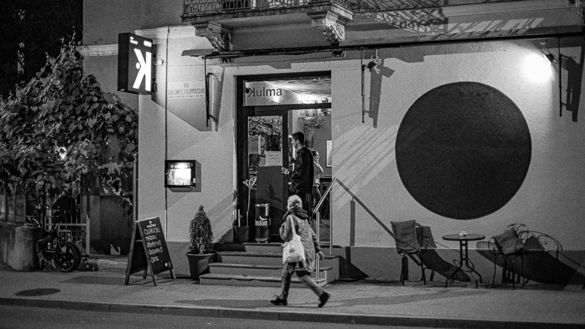
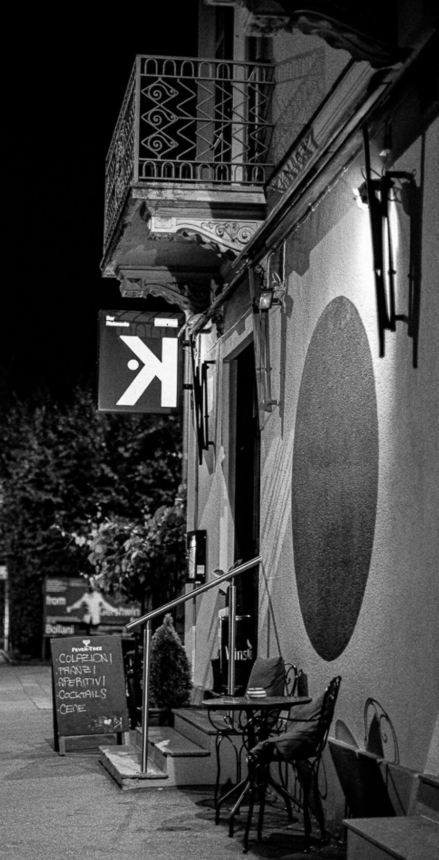
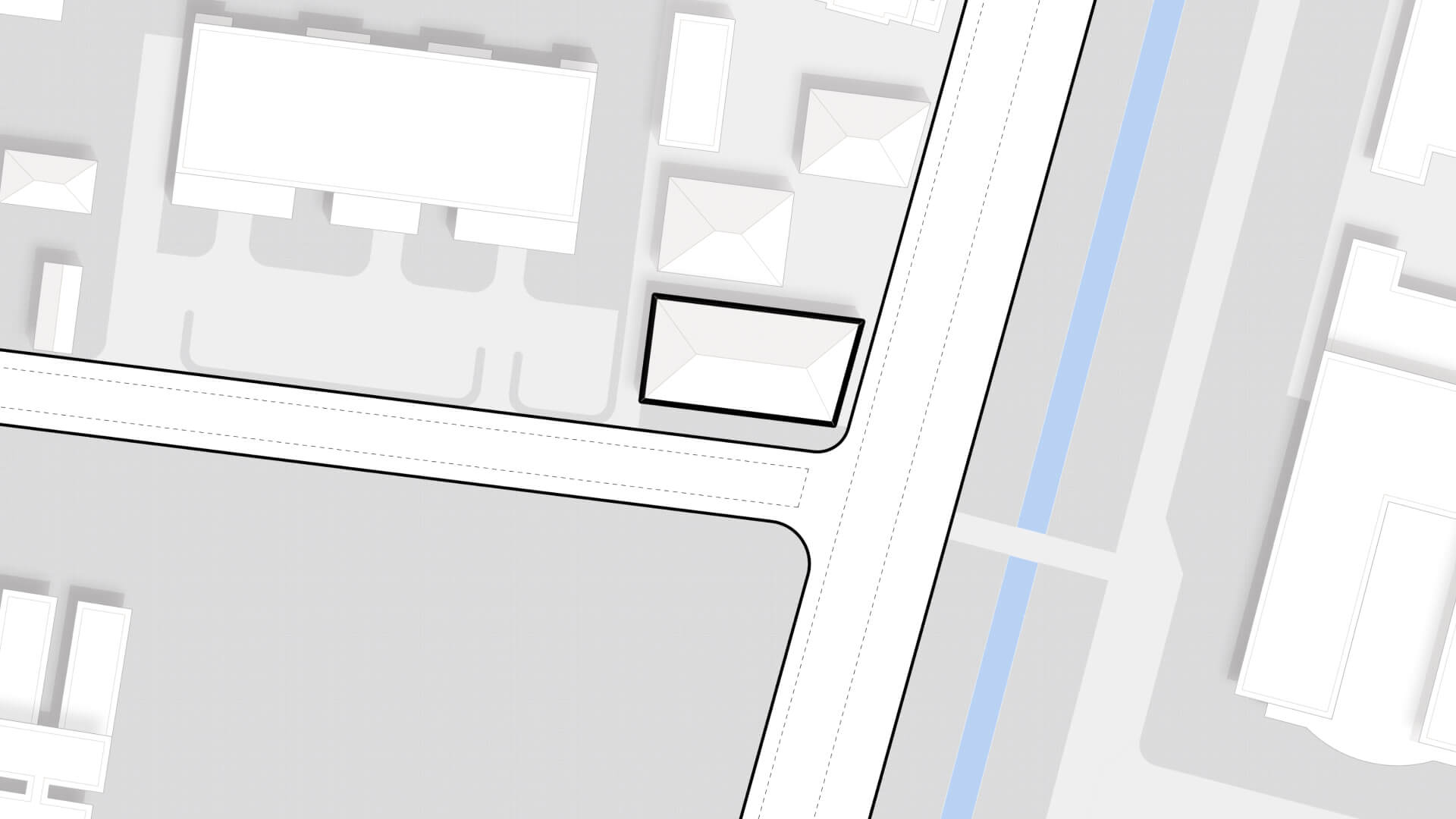
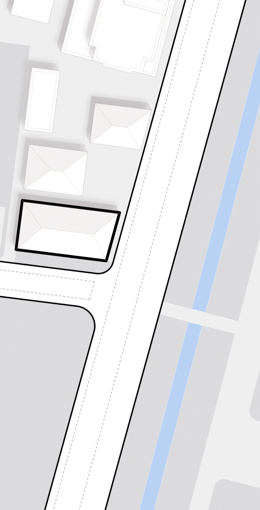
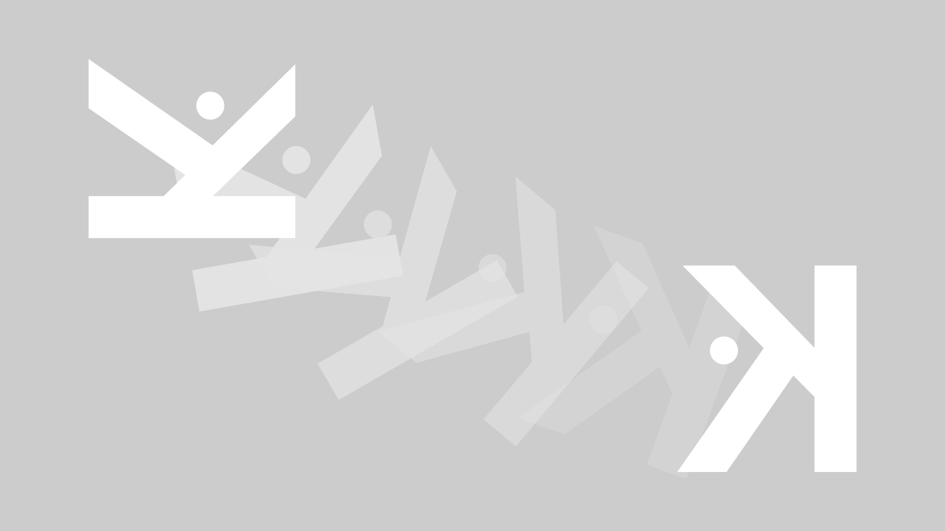
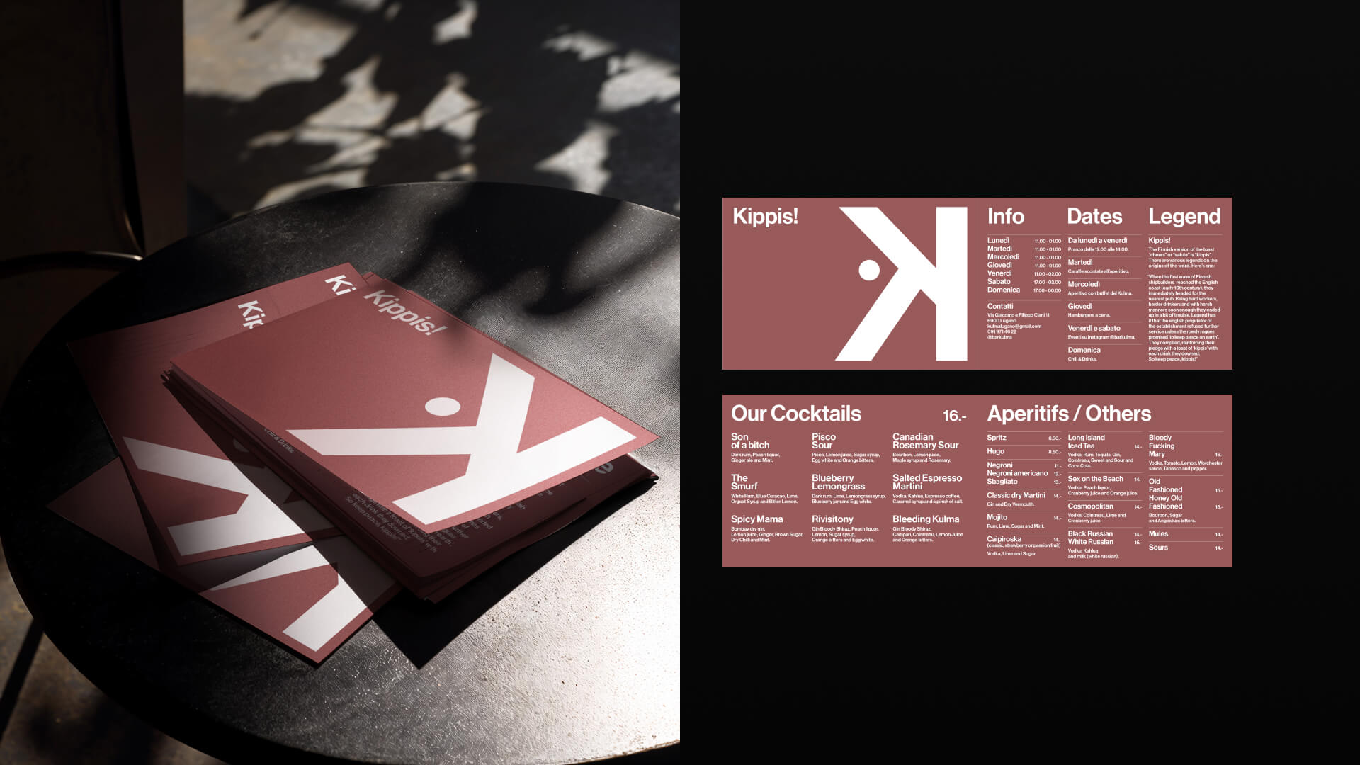
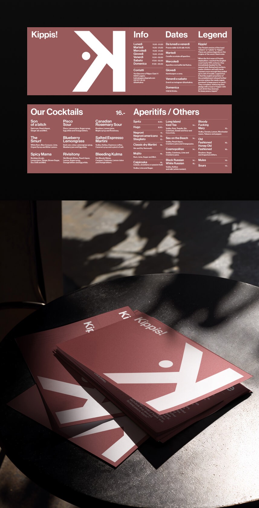
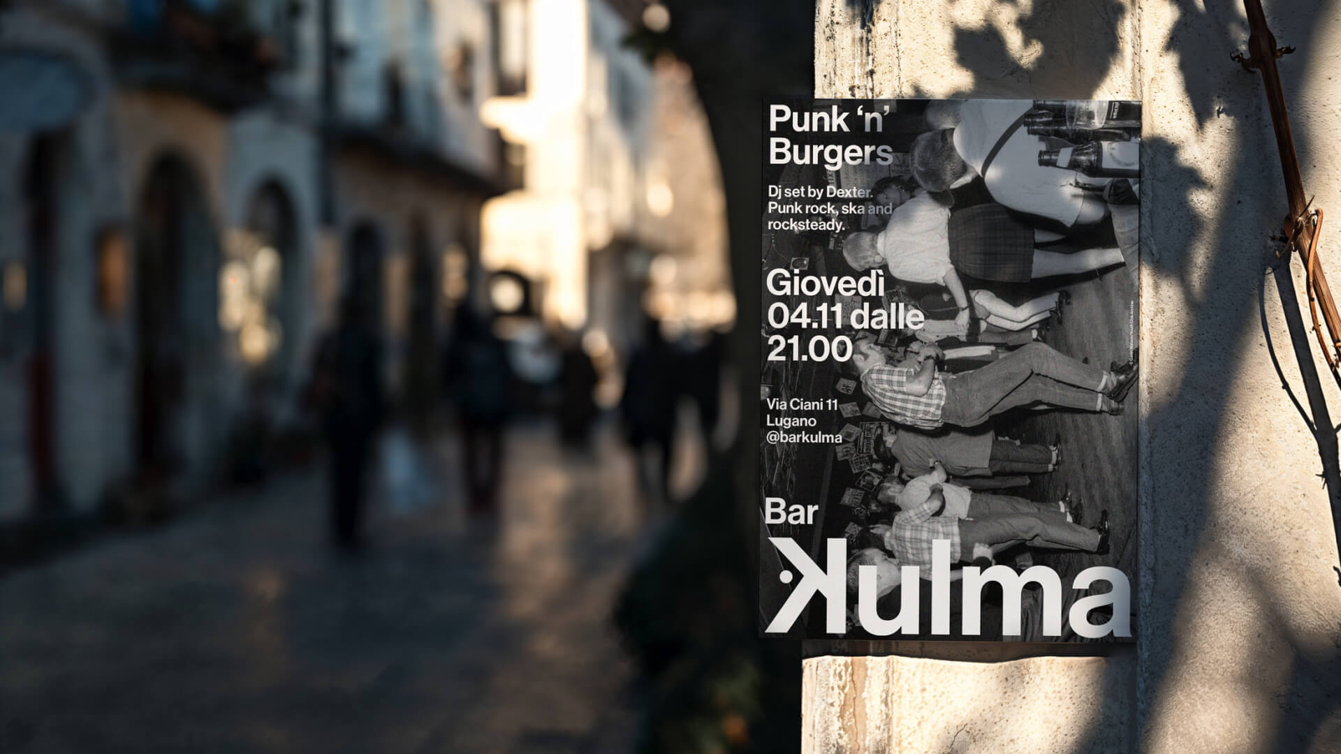
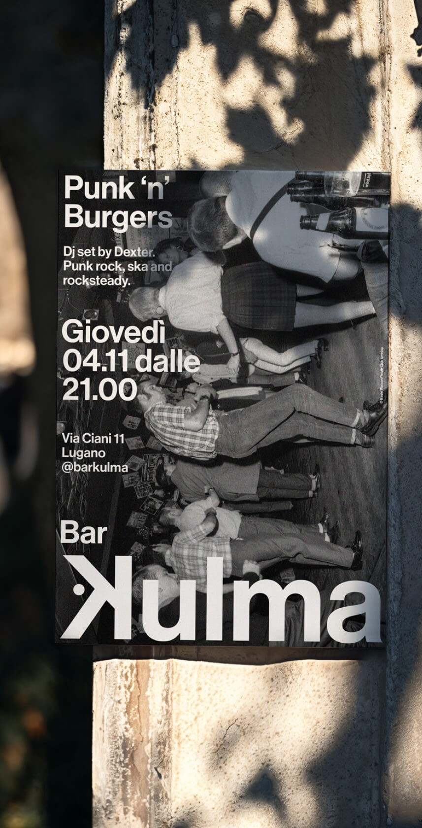
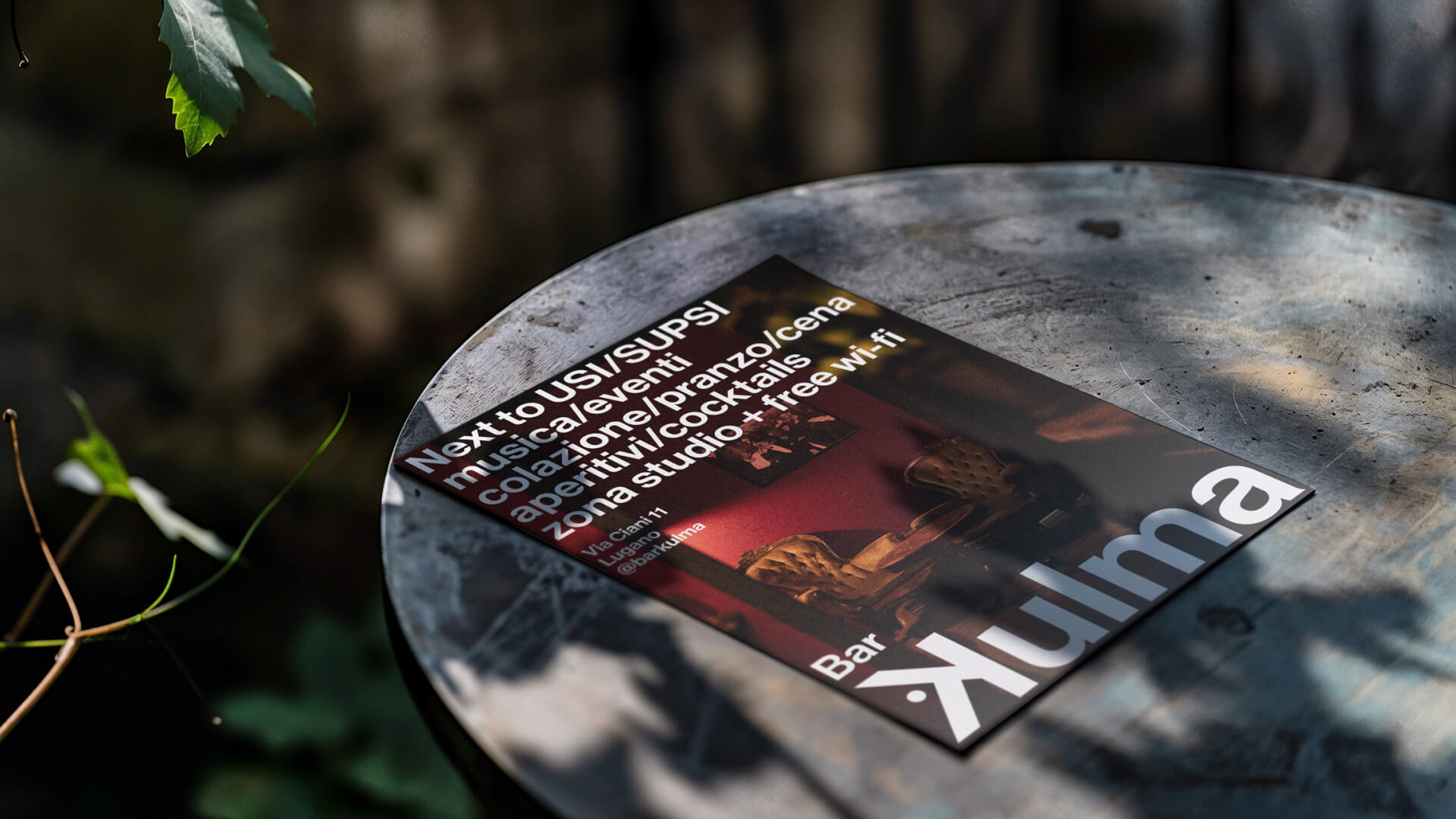
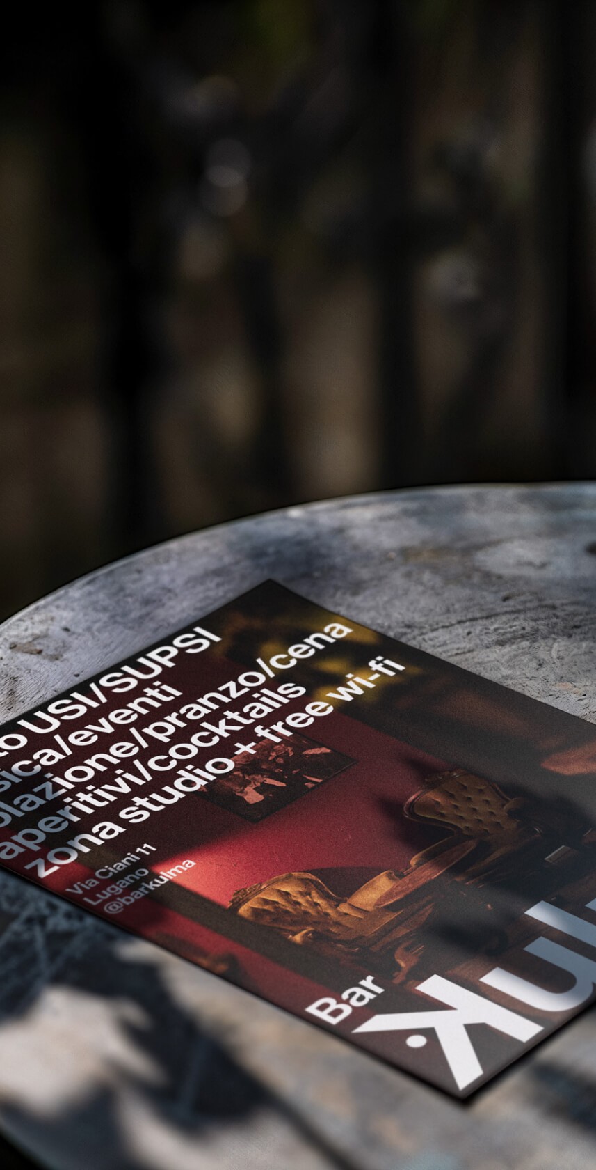
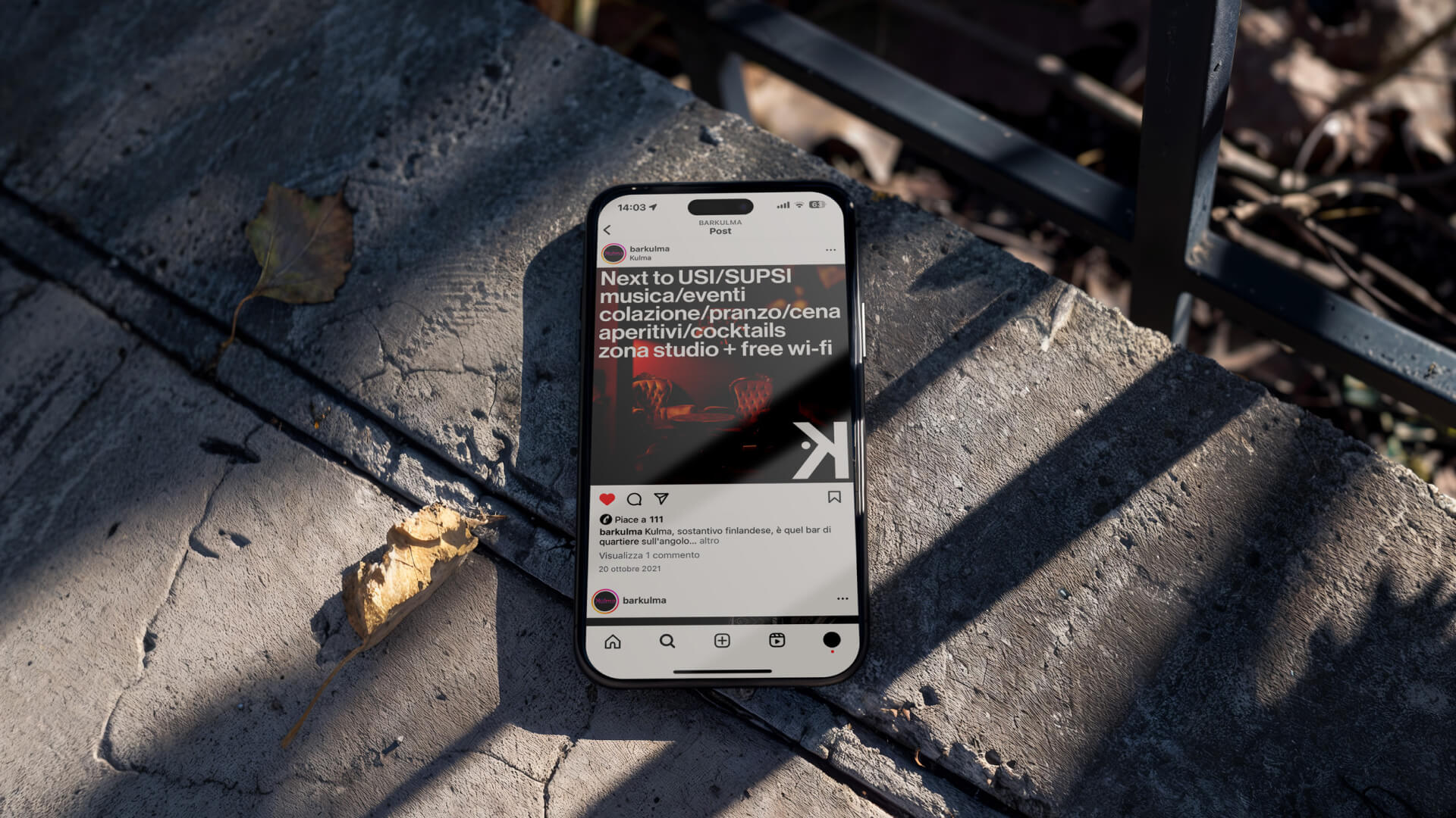
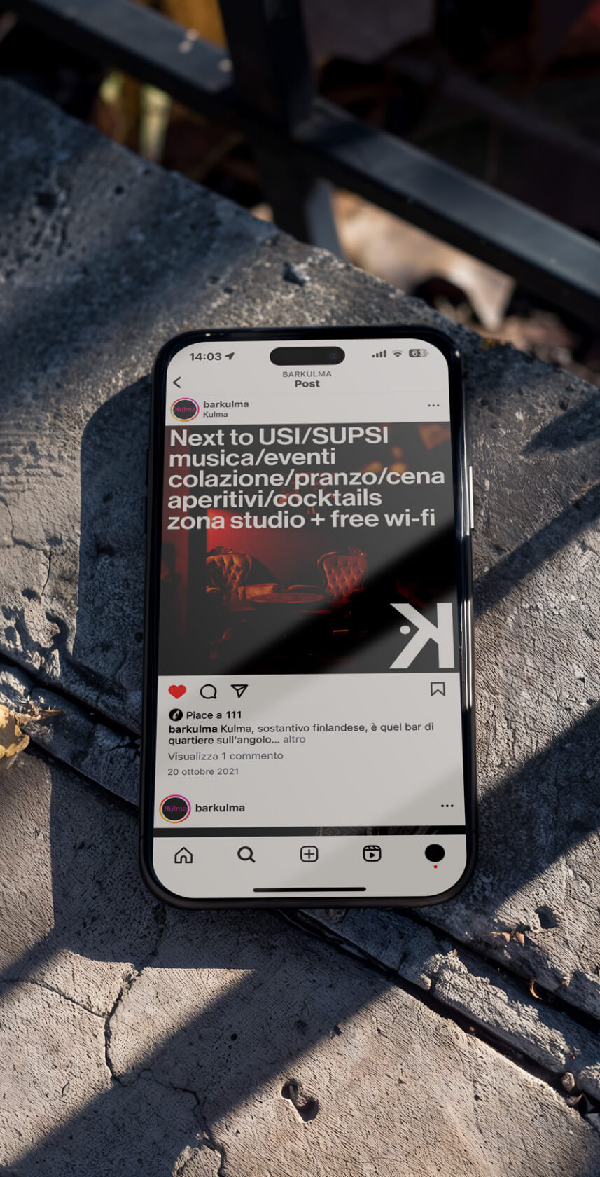
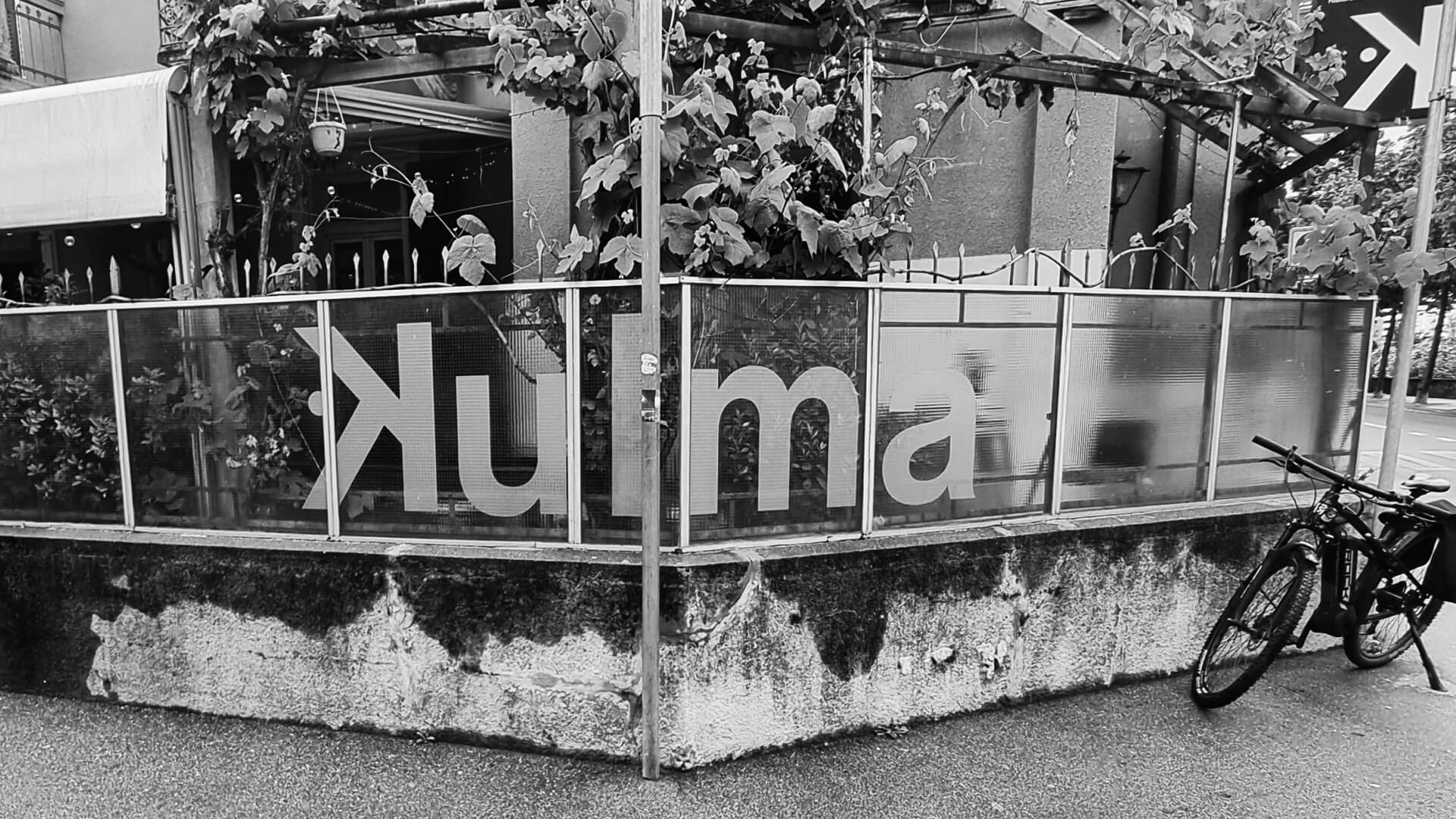
Sami and Rawi were opening their own bar in Lugano. After years as bartenders this was finally theirs. They called it Kulma — “corner” in Finnish. It’s on a corner. Sami’s Finnish. That was enough. When a name makes that much sense, it tells you where to start. They asked us to take care of everything — the logo, the signage, the menus, the printed bits, the digital ones. We started with the name, and ended up in the Finnish alphabet. The last three letters — Å, Ä, Ö — stood out. Those dots above the letters — the diaeresis — felt precise. Graphic. Quietly strange. We kept just one. A black dot, on its own. At the same time, we pulled up a map of the area. The bar sits exactly where Via Giacomo, Via Filippo Ciani and the Cassarate river meet. Those three lines — two streets and a river — became the K. Three strokes. Three directions. And where they meet: the dot.
1
/
3
<-
->
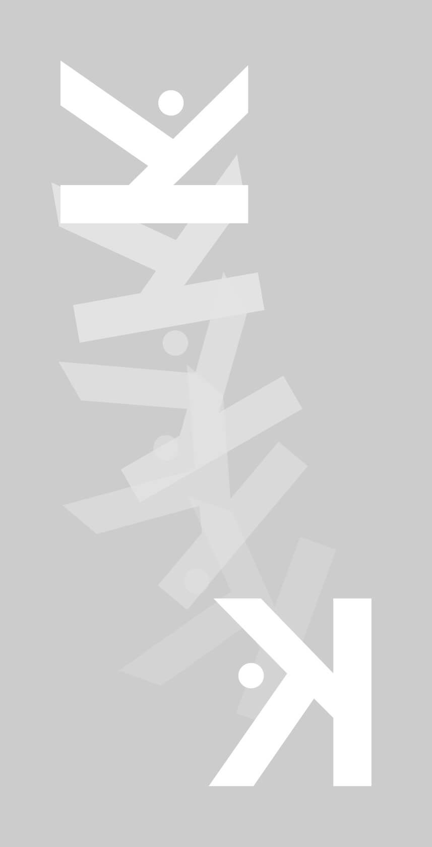
CREDITS AND DETAILS
CONCEPT
Studio Syamo
PICTURES
Studio Syamo
Kulma
Yuki
ARTWORKS
Studio Syamo
TYPEFACE
Neue Haas Grotesk // Linotype
YEAR
2021
CATEGORY
Brand design
TOOLS
Figma, Midjourney, Magnific AI, Adobe Indesign, Adobe Photoshop,
Adobe Illustrator